Shades of Purple | Domenico Colace
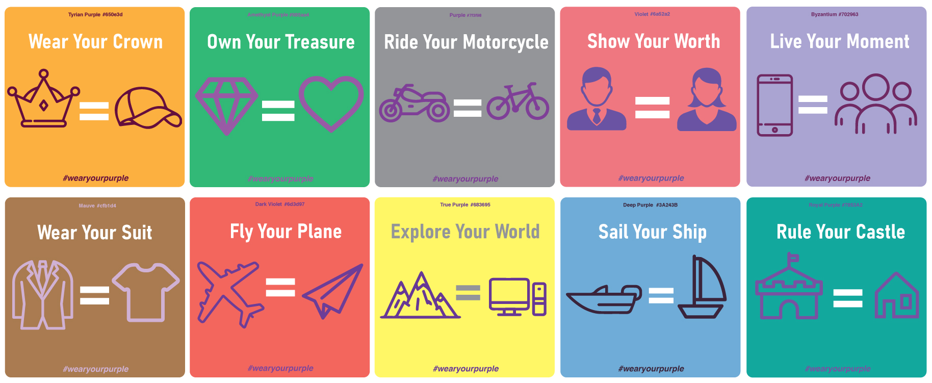
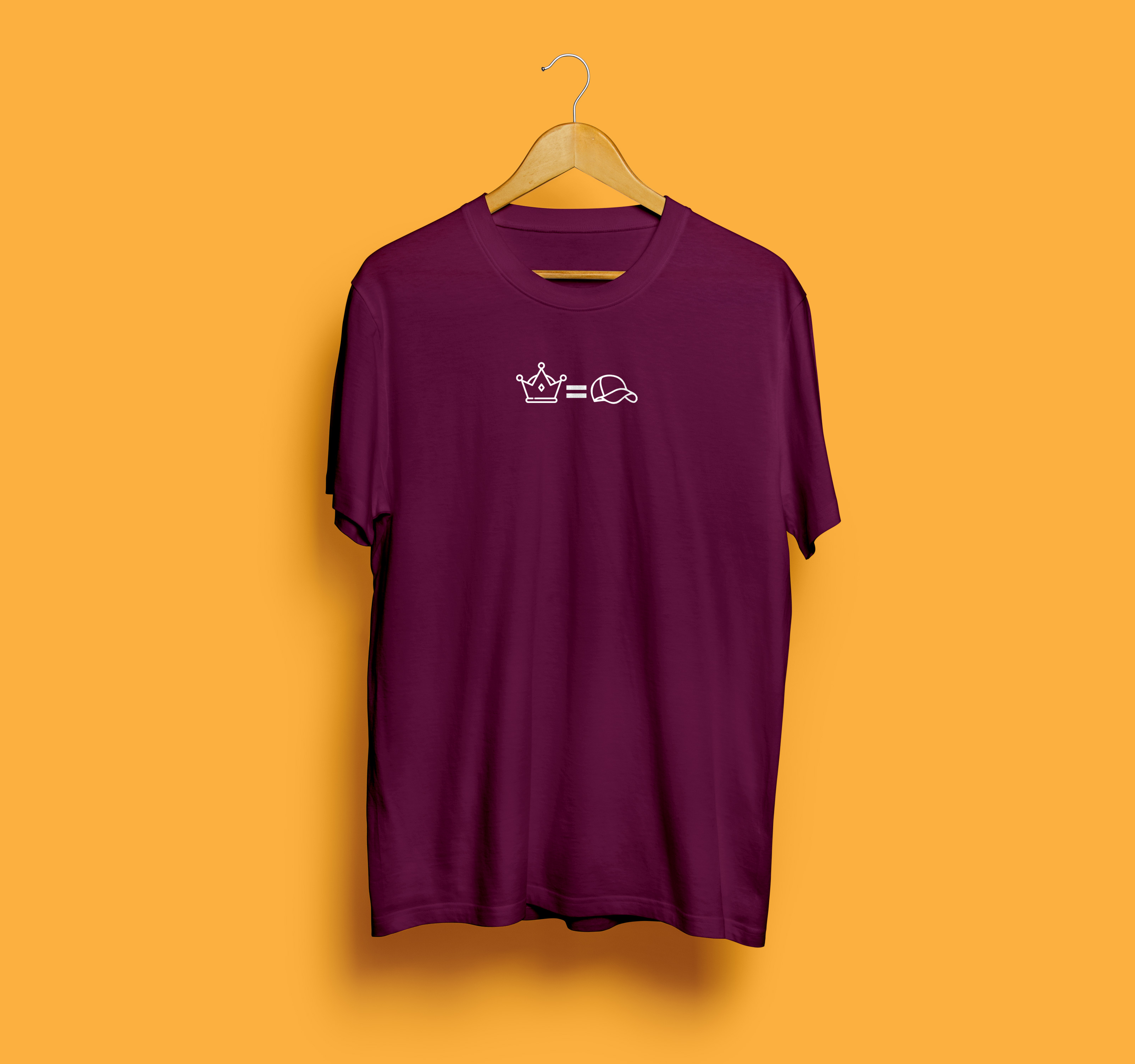
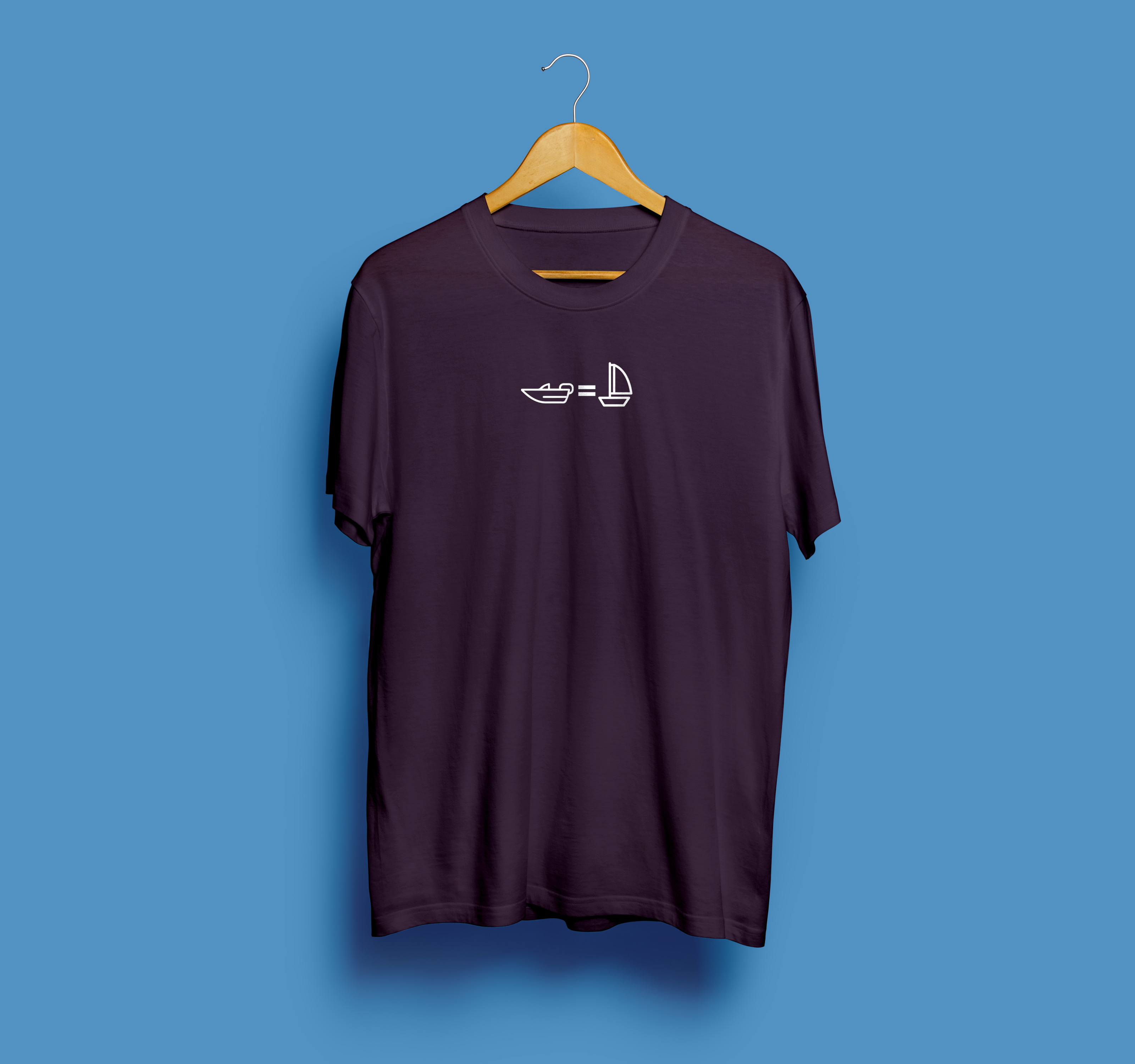
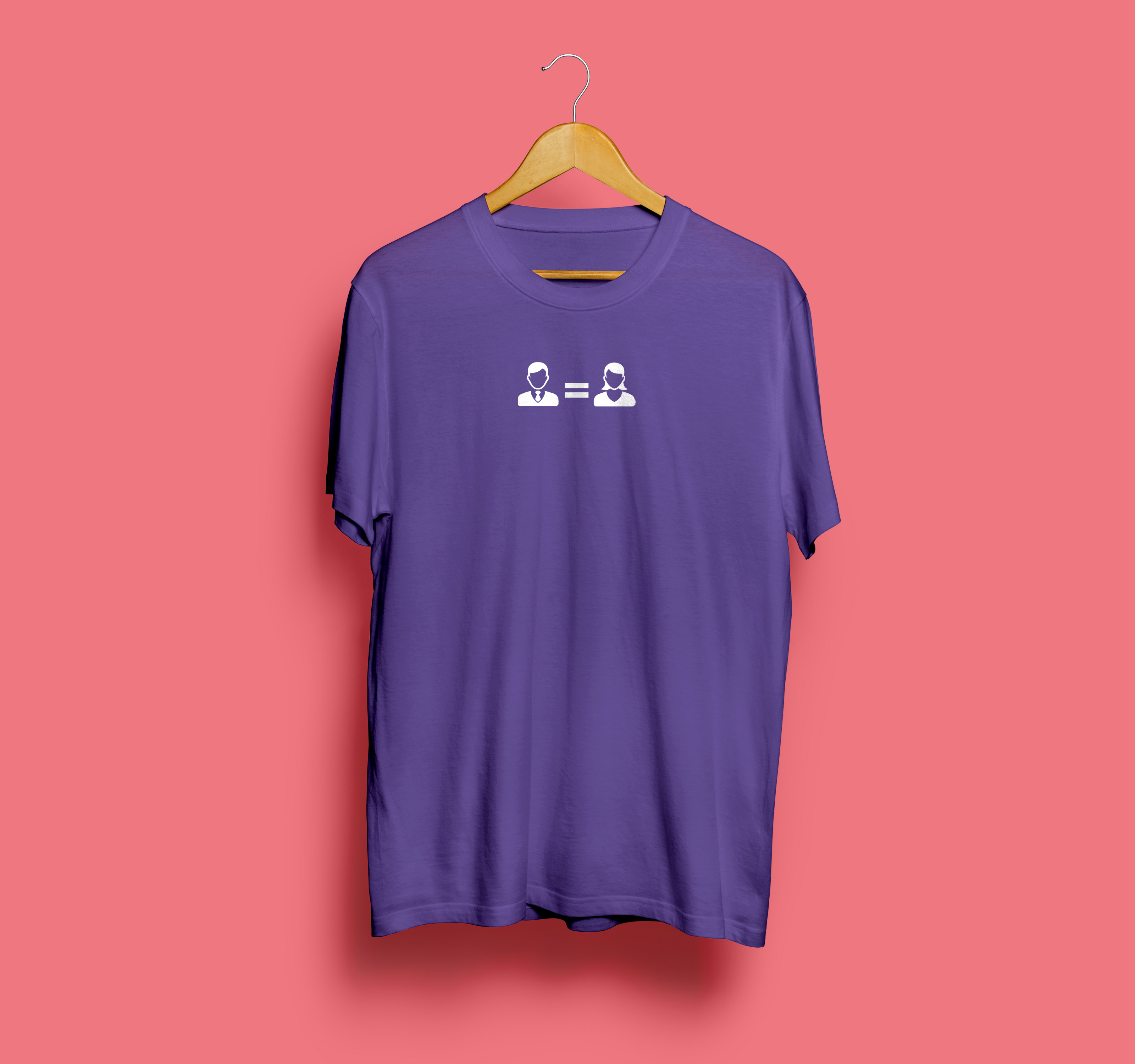
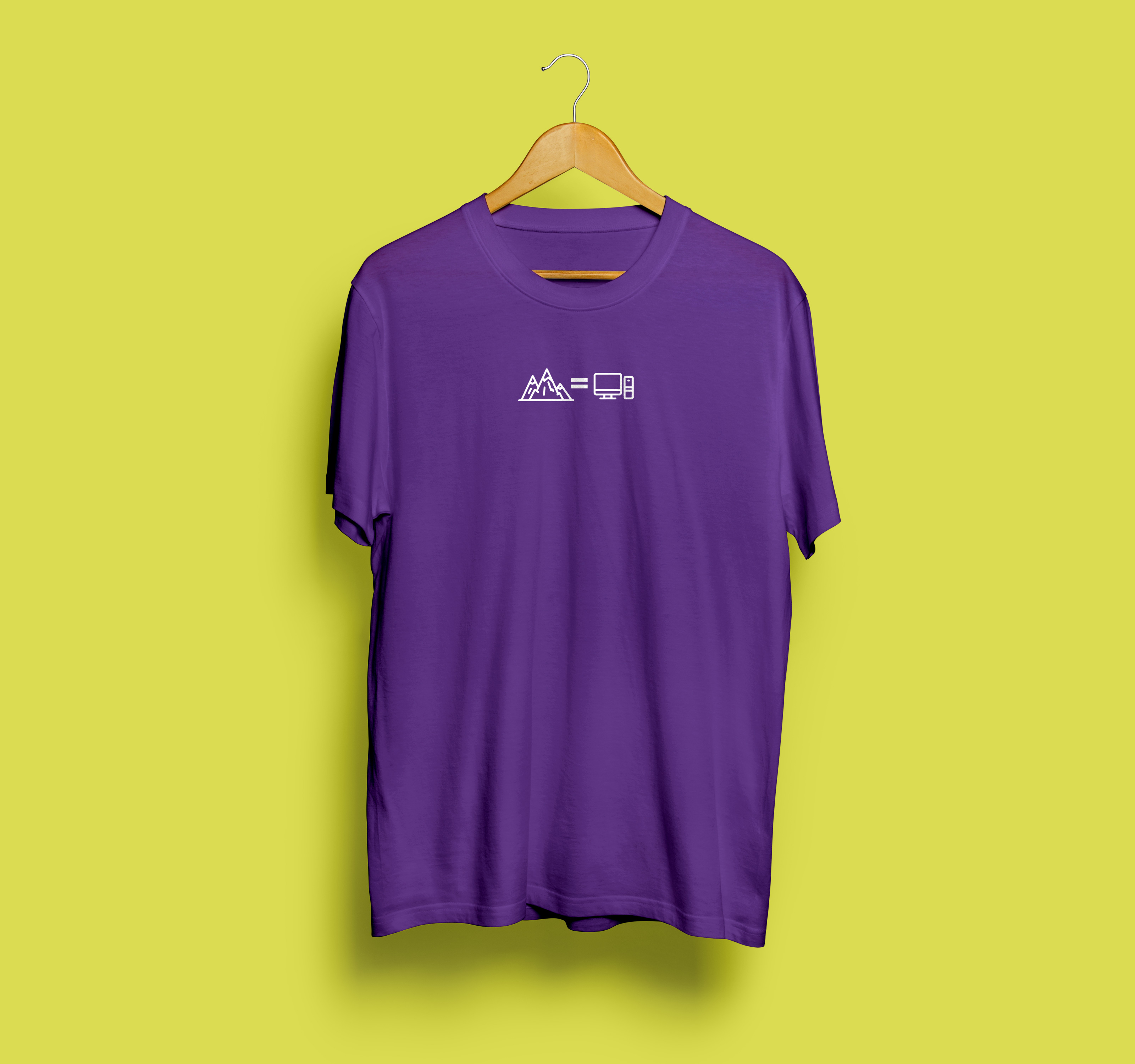
For this project I researched the color purple. I followed purple’s journey through time from its first creation out of shells to it becoming the defining color of royalty, to its transition of the first readily available industrial dye and even to its use in the fight for Women’s Rights and equality. Traditionally purple is seen as a color reserved for the aristocracy or even royalty because of how expensive it used to be to manufacture. However, in modern times that has change allowing purple to become available for any and everyone. From this idea, my concept was to take shades of purple and to represent situations where people may feel they are not wealthy enough or good enough and to convey that that is incorrect. It began with the idea of “Wear Your Crown,” where I showed that a ball cap is just as good, if not better than a real crown. I pursued this and applied it to other situations modern day people may find themselves in. I decided my delverable would be that of stickers which would contain the icons I made as well as slogans for each image. These stickers would serve the purpose of becoming branding for a fictional tshirt brand that would be an affordable streetwear brand for people who cannot spend money on the expensive brands of today. These shirts would be made in varying shades of purple to show the versitality of the color and that purple could mean much more than one would know. What shade are you?


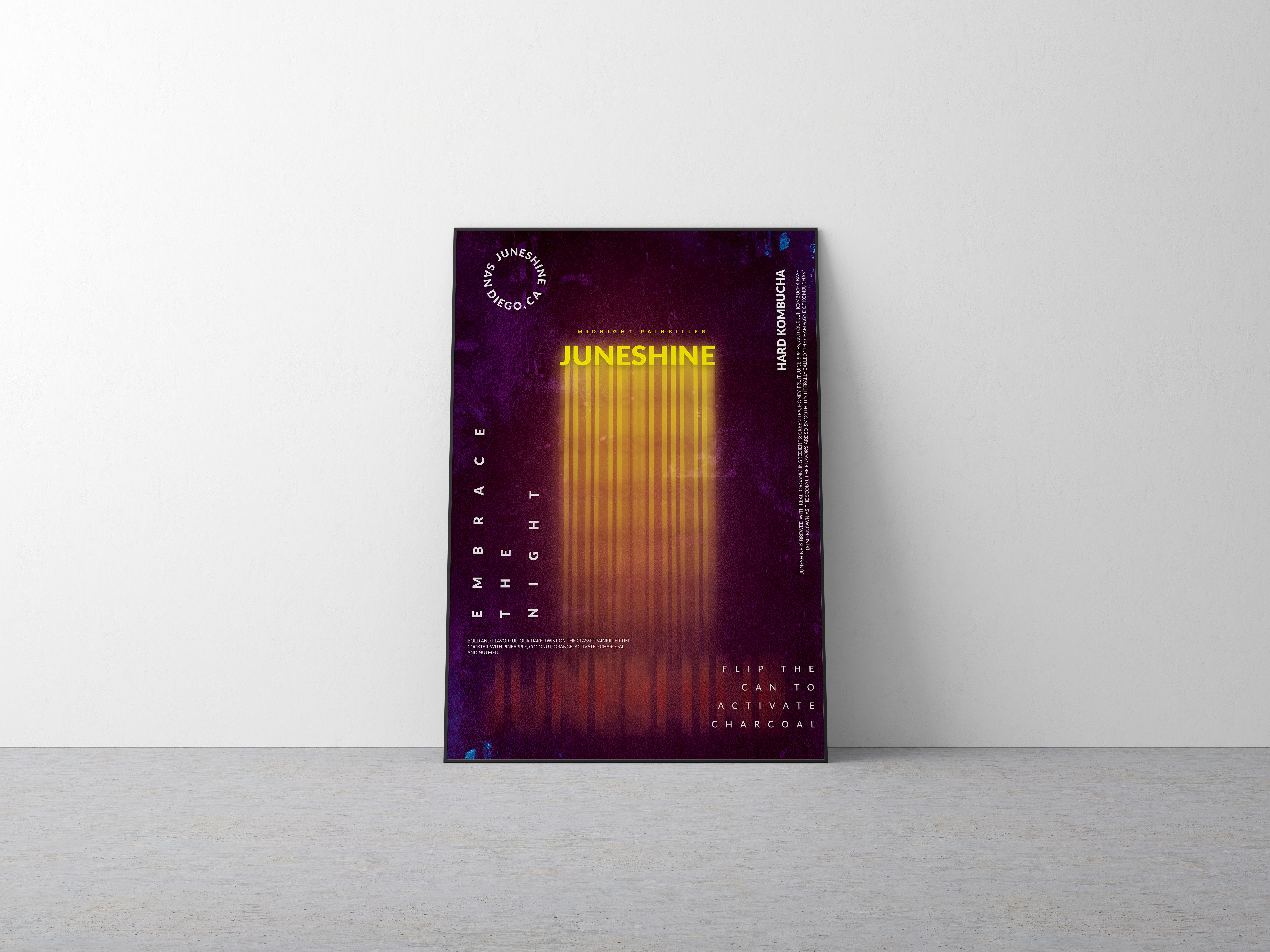
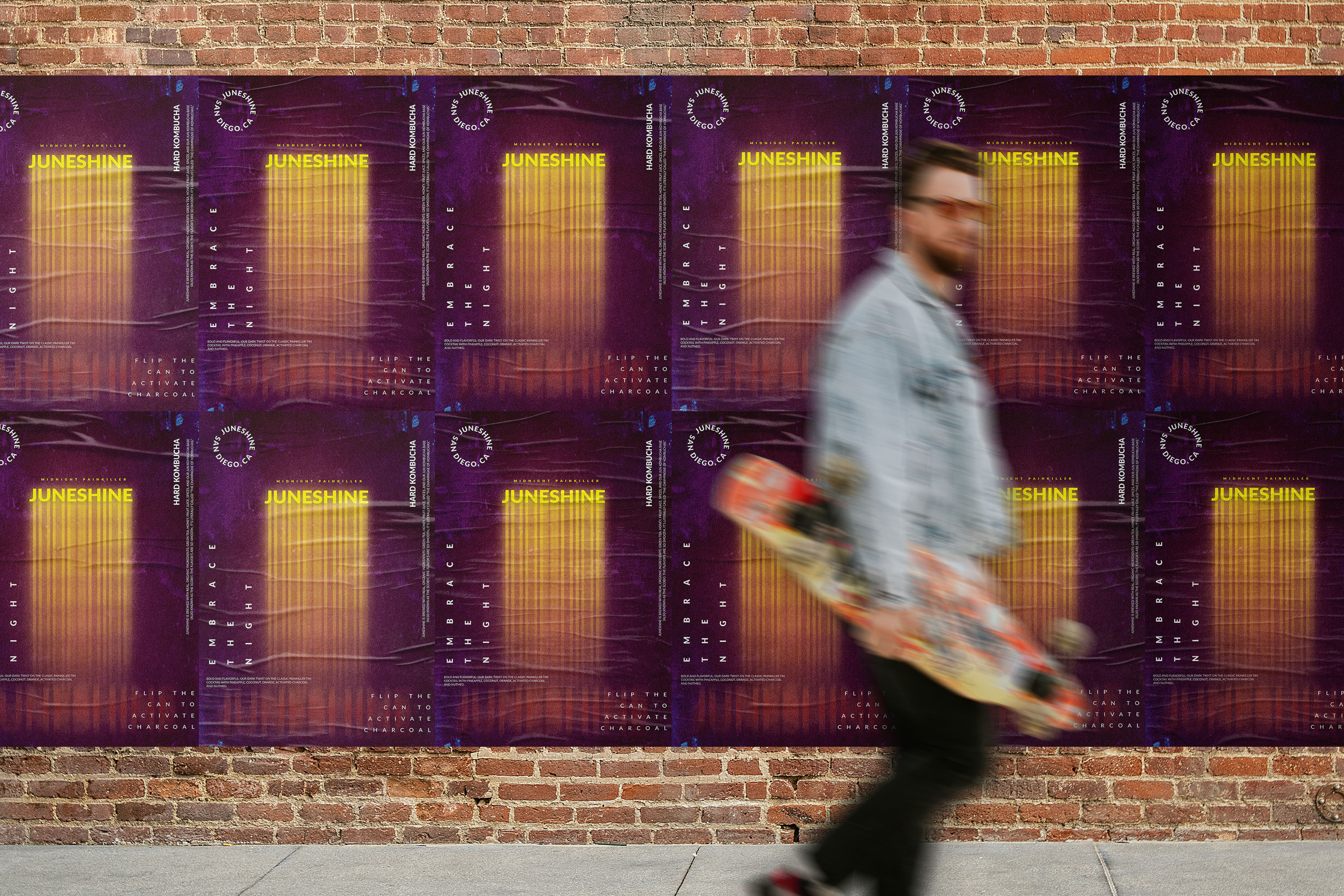
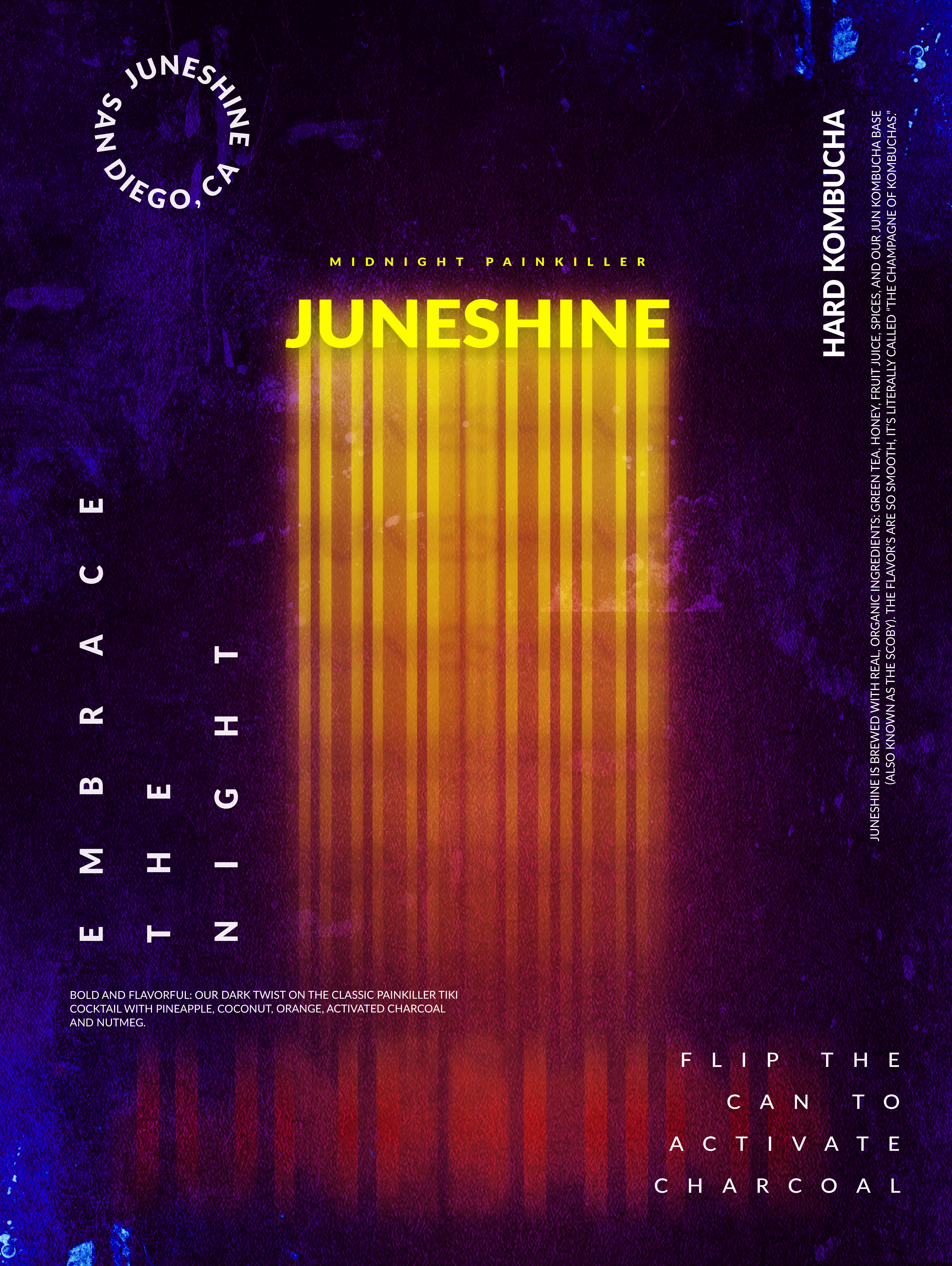
Midnight Painkiller | Nina Gozzi
Midnight Painkiller is a branding project for JuneShine Hard Kombucha. Bold and flavorful- Midnight Painkiller is a dark twist on the classic painkiller tiki cocktail with pineapple, coconut, orange, activated charcoal, and nutmeg. JuneShine is a community of adventurers, artists, athletes, and creatives who share a passion and want to leave a positive impact on the environment. We all fell in love with the refreshingly smooth taste of jun kombucha and have made it our mission to brew the highest quality and healthiest jun kombucha out there.
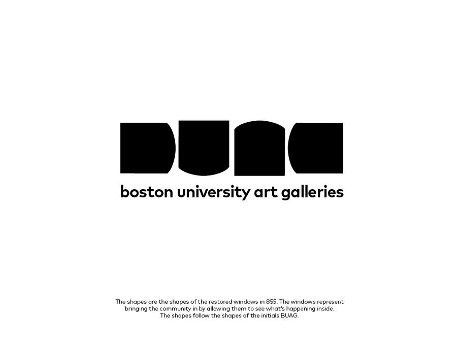
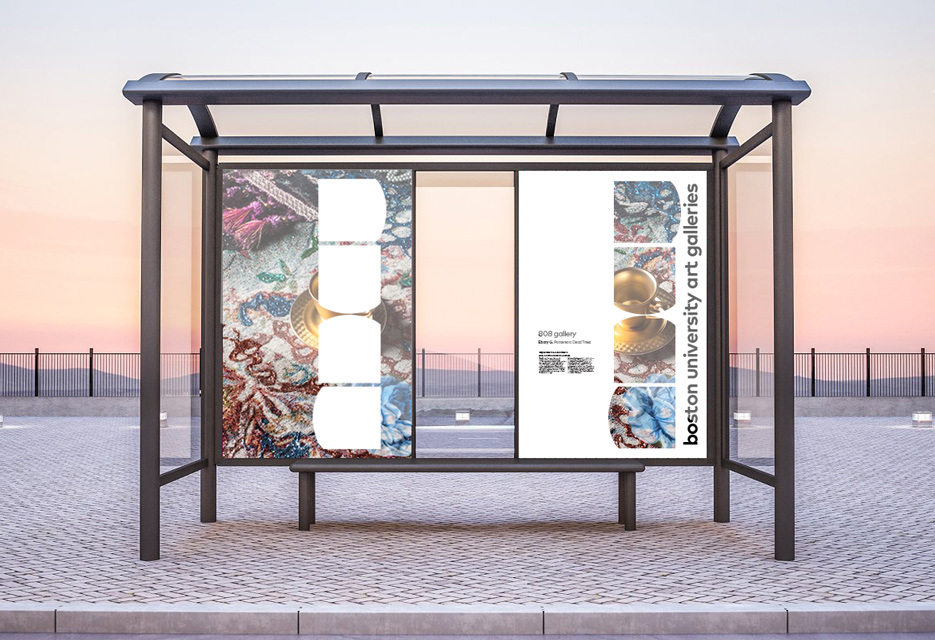
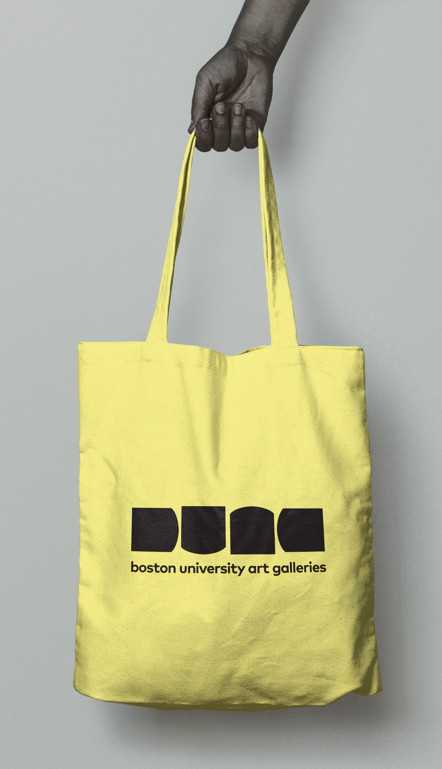
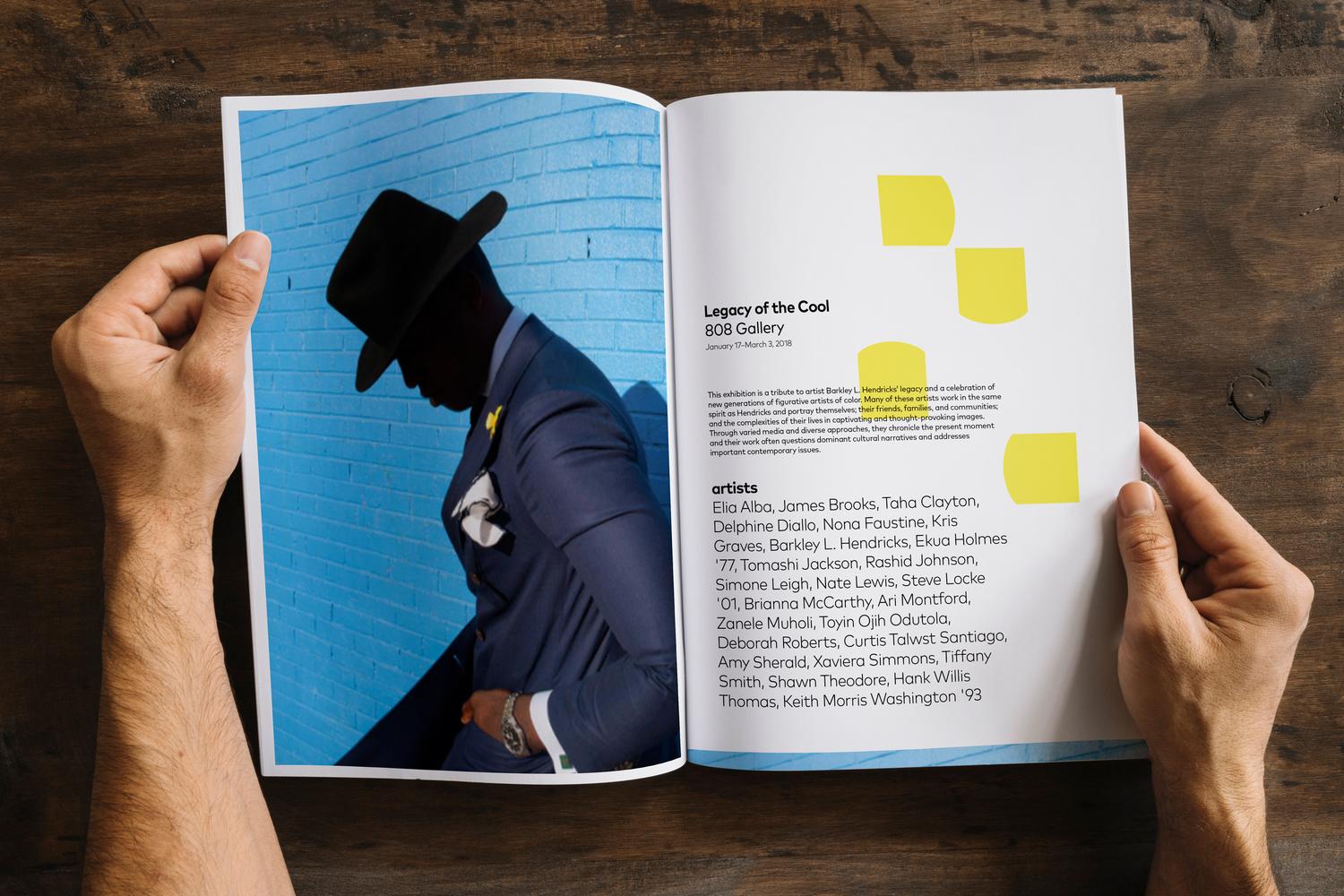
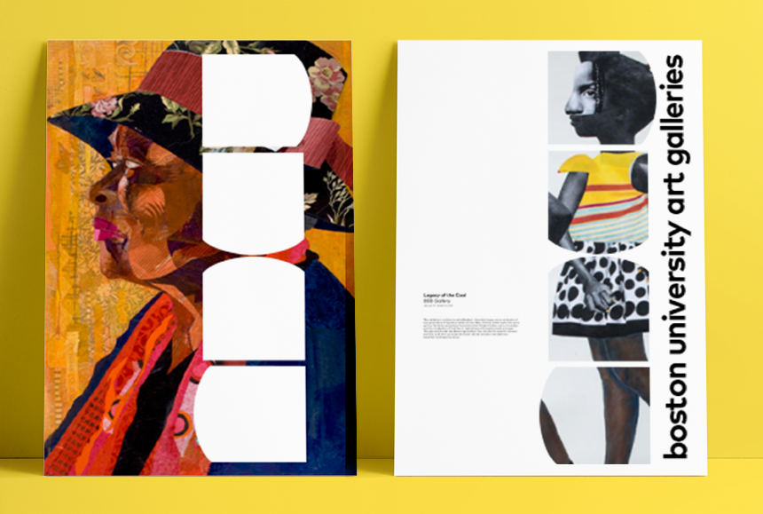
BU Art Galleries | Amy Kunberger
This branding project is meant to reflect the planning and care that has gone into renovating and rethinking our gallery spaces on campus. The BU Art Galleries are dedicated to showcasing contemporary artists; including our art students. The galleries are an important part of the culture on Comm Ave; the large windows of 855 were restored so that even off-hours, passers by can check out what’s happening in the galleries. This mark is based on the symbolism of these windows. The shapes follow the shapes of the initials—b u a g.
The New Normal | Treasa Benny
Post pandemic, everyone's routine has been drastically altered in more ways than one. There's one activity, in particular, that stands out the most which can now be considered a part of that routine. Incorporating that action allows the overall message to still be a documentation of an everyday practice, which was our “normal”, but can now be considered the latest addition to our norm…
The New Normal from Treasa Benny on Vimeo.
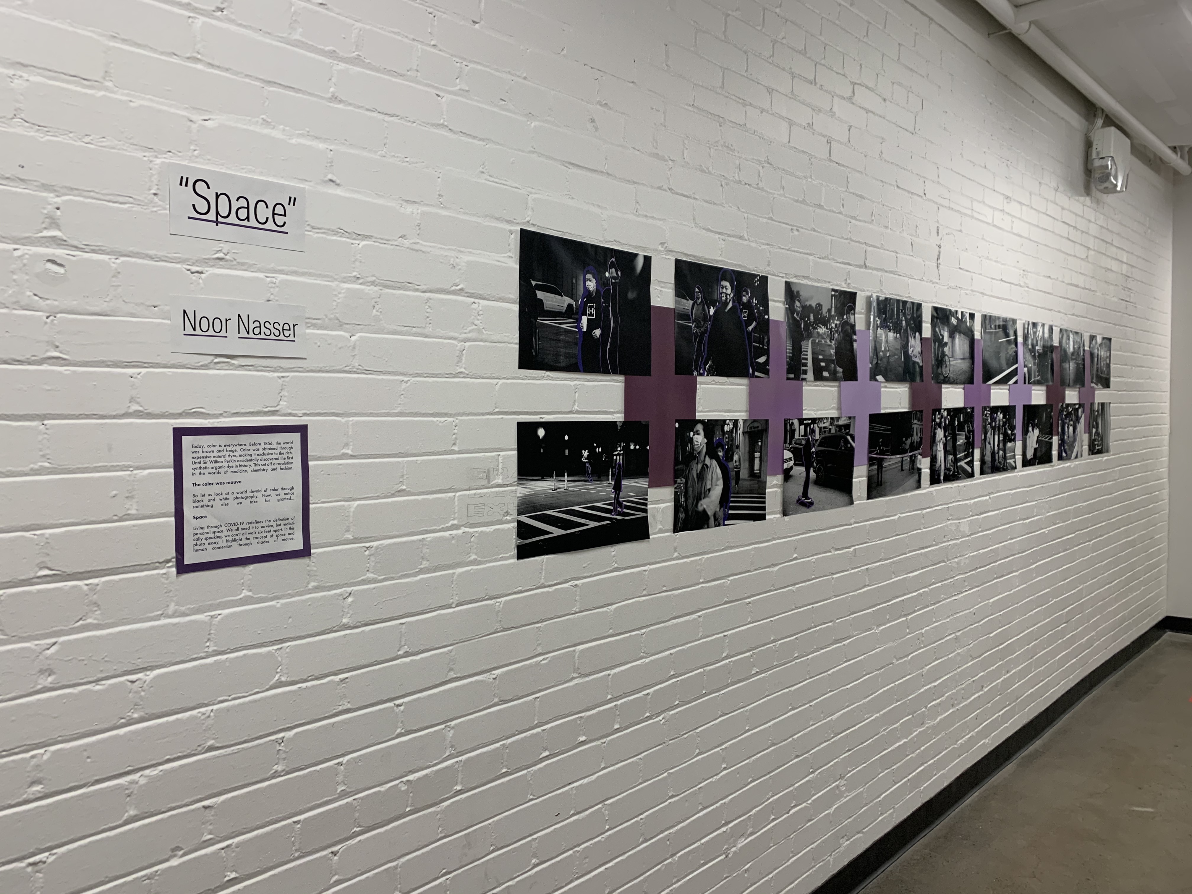
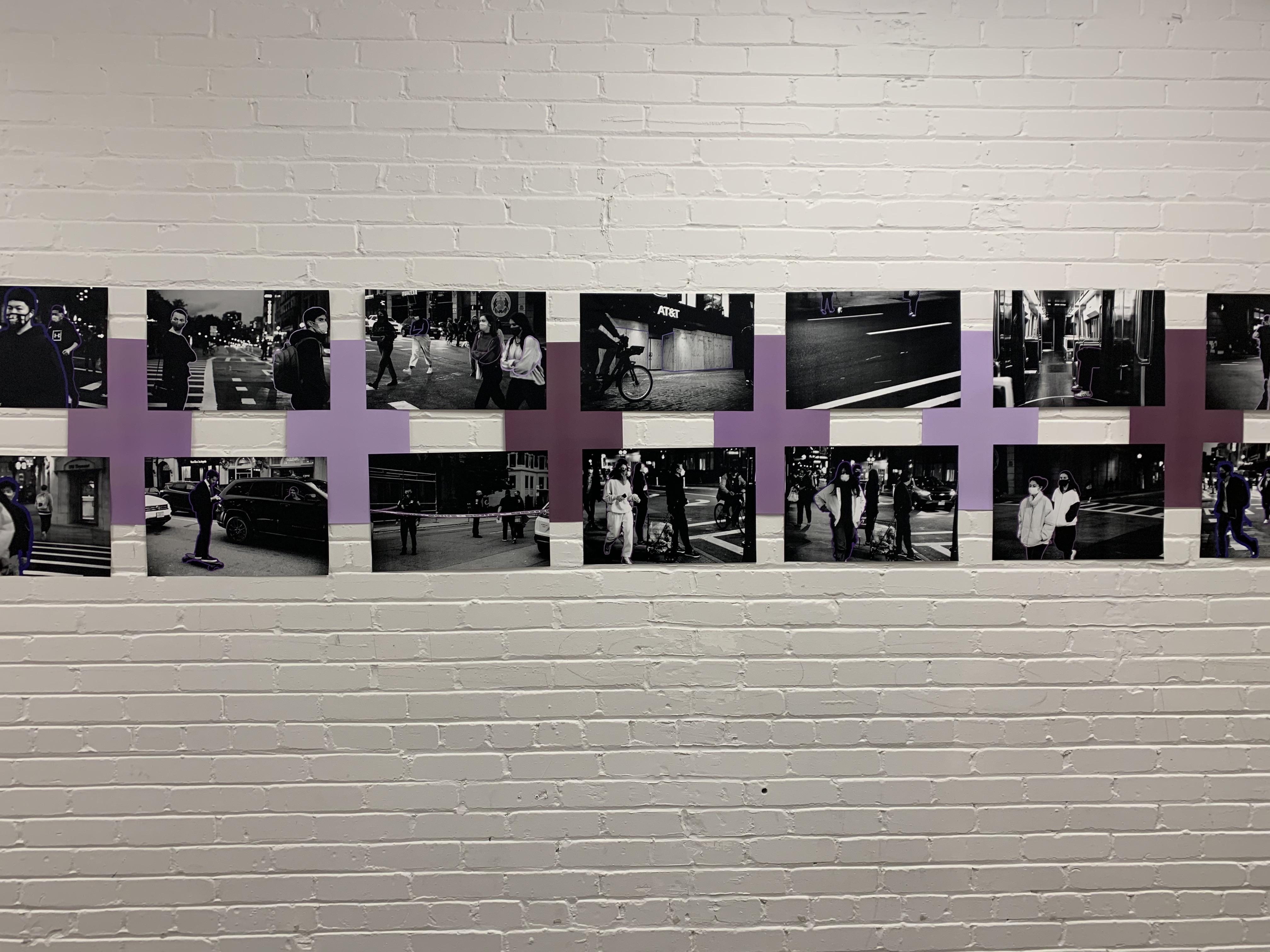
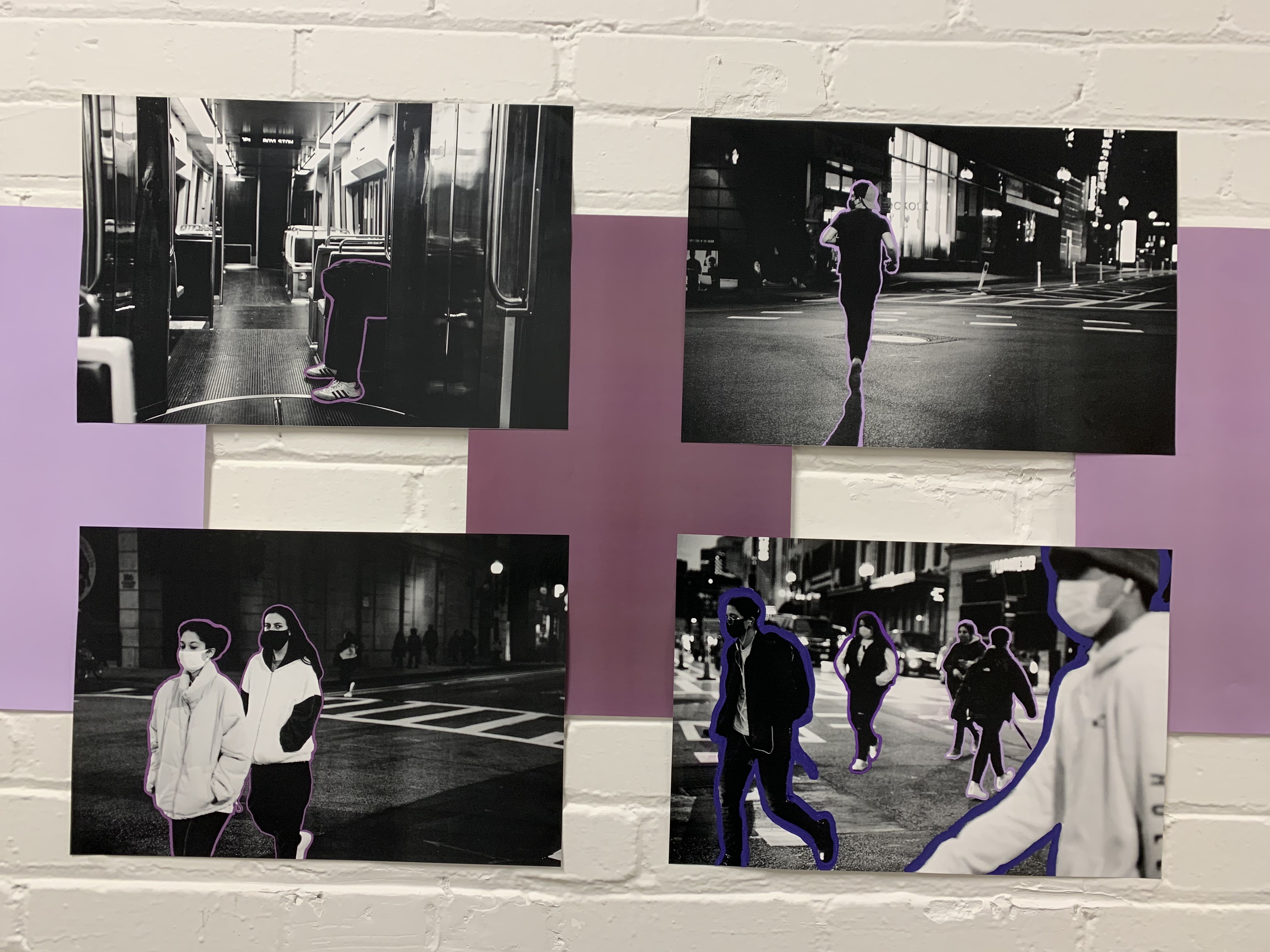
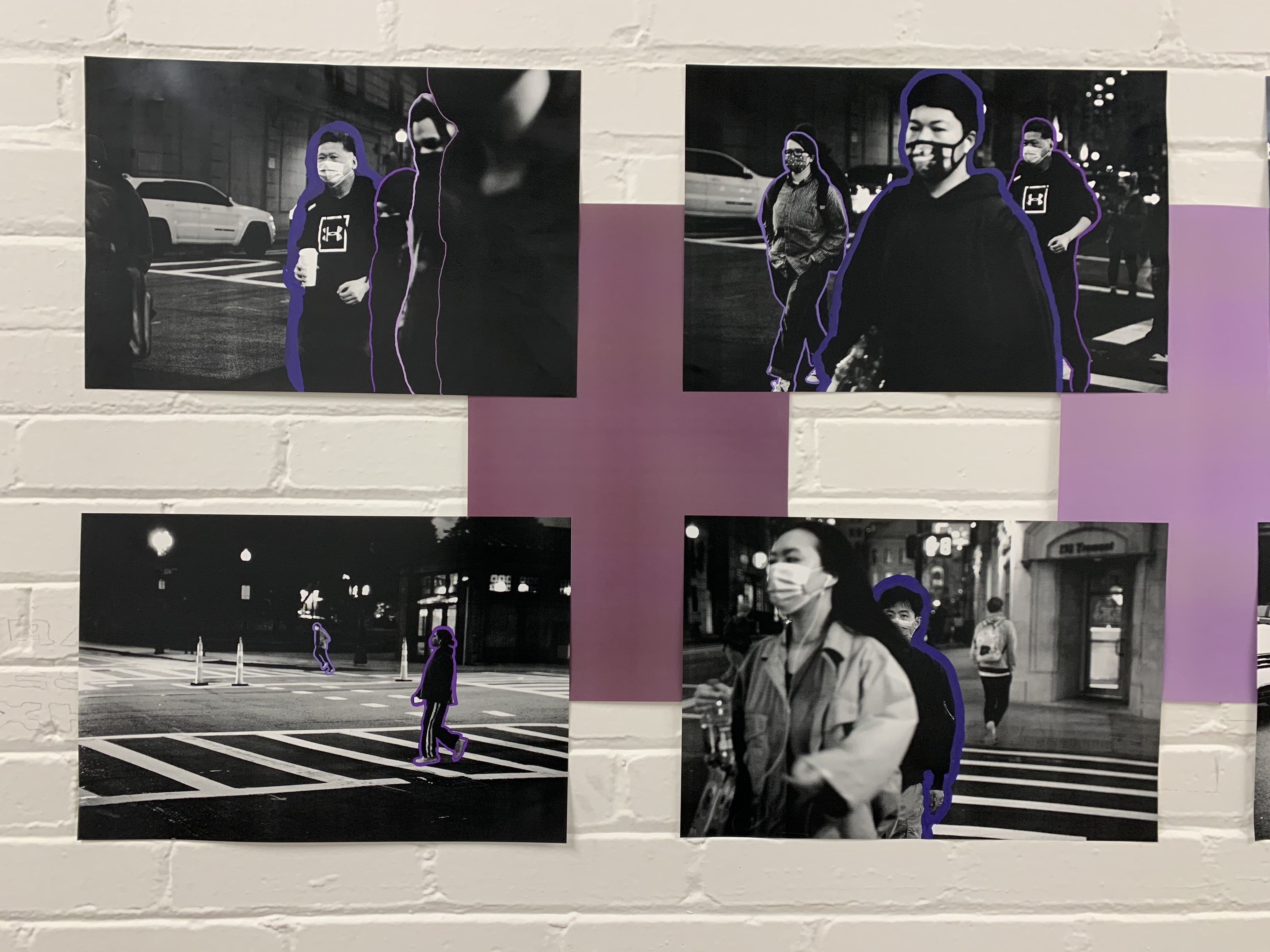
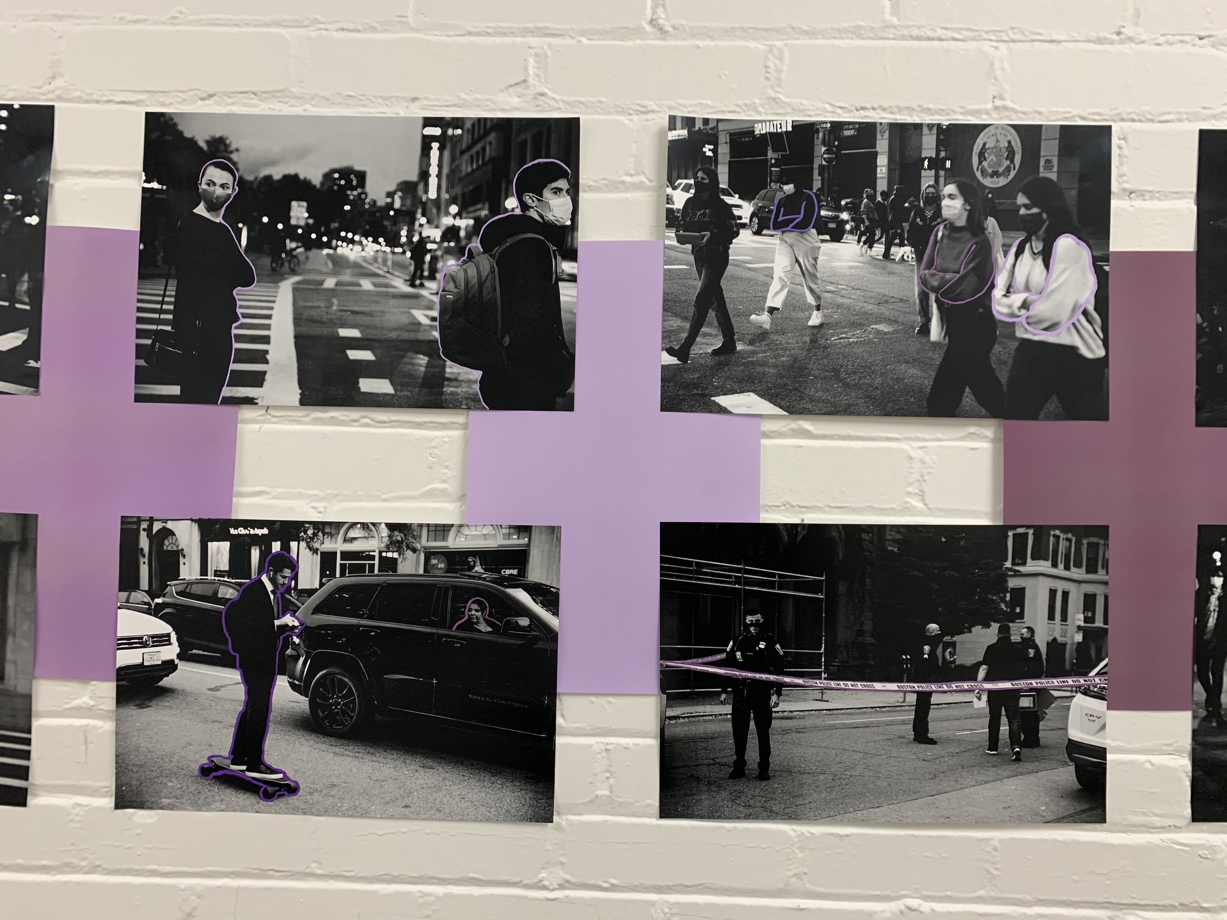
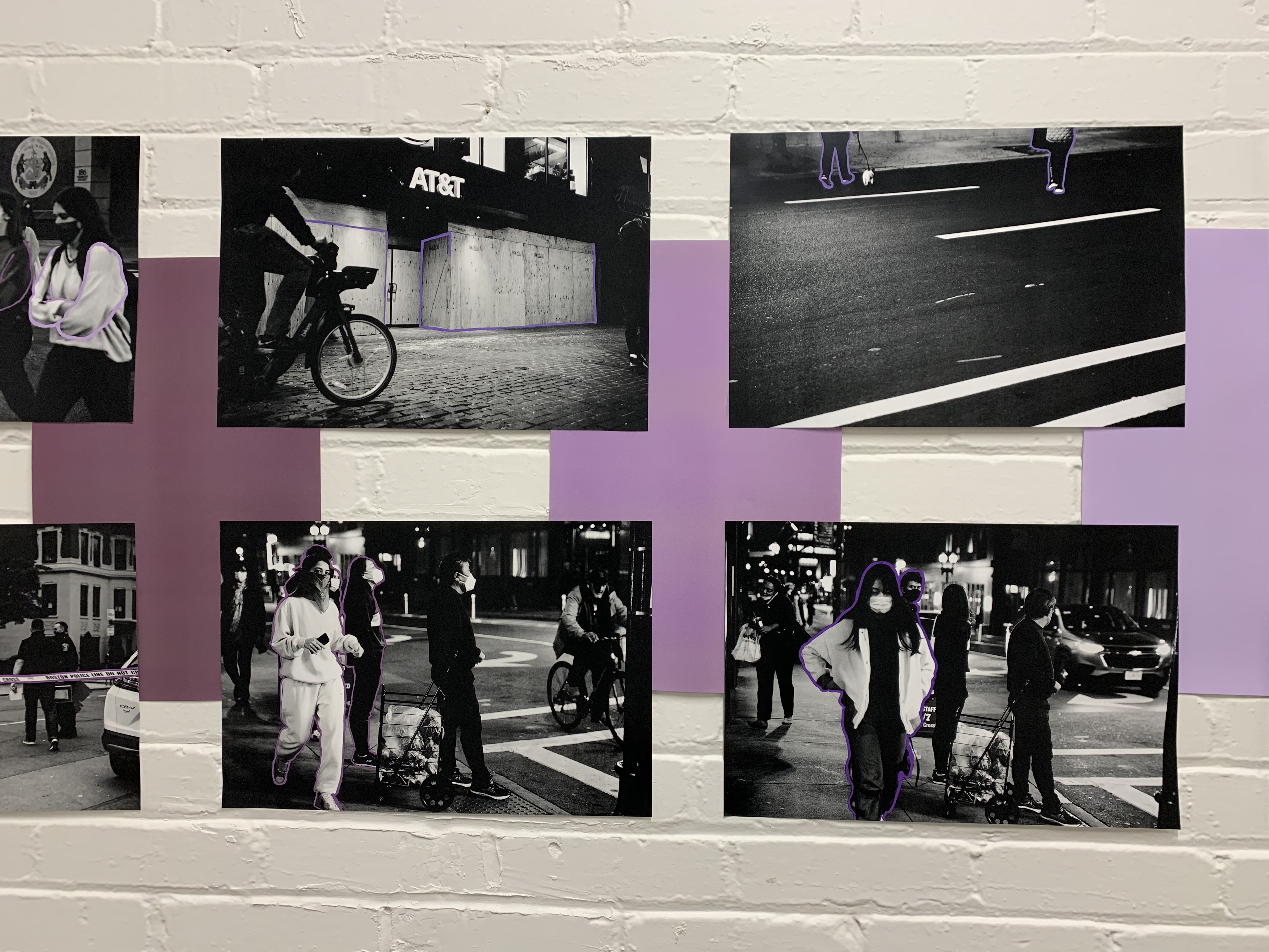
Space | Noor Nasser
Today, color is everywhere. Before 1856, the world was brown and beige. Color was obtained through
expensive natural dyes, making it exclusive to the rich. Until Sir Willian Perkin accidentally discovered the first synthetic organic dye in history. This set off a revolution in the worlds of medicine, chemistry and fashion.
The color was mauve. So let us look at a world devoid of color through
black and white photography. Now, we notice
something else we take for granted...
Space. Living through COVID-19 redefines the definition of personal space. We all need it to survive, but realistically speaking, we can’t all walk six feet apart. In this photo essay, I highlight the concept of space and human connection through shades of mauve.